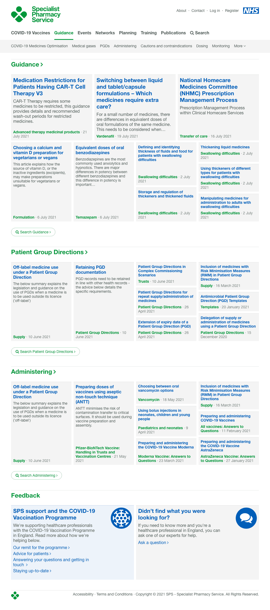


Product overview showing a topic page with a proper editorial hierarchy, and a complex article collection with automatic subheading navigation
I was Lead Product Designer in a cross-disciplinary team on a project spanning 7 years, helping to drive and influence product decisions and strategy while thinking like a tax payer.
Following a successful procurement, I joined the team tasked with transforming four distinct services into a single new entity and delivering a digital platform that speaks with one voice as part of NHS England.
The four distinct services had an existing repository of high quality content, unfortunately dispersed throughout 17 different protected systems.
The first practical challenge was to bring the existing material together in one place, then make sure it was easy to find with a structure and hierarchy that could evolve alongside the service.
During early conversations and workshops it became clear that we must be respectful to taxpayers: everything should be frugal and deliver maximum possible value. In terms of aesthetics this ruled out the use of any imagery; instead the challenge was to focus only on competent use of typography, space and hierarchy.
As a brand new service bringing together different stakeholders for the first time, it was important to join the dots and establish a shared vision. We ran a lightweight vision and values workshop during which the team established their purpose, vision, tone of voice and strap-line. We identified a range of potential users that would provide insight to shape the first version of the service.
For the very first version of the site we commissioned an approved gov.uk UX agency to undertake the extremely time consuming task of interviewing a range of stakeholders and potential users. This gave an initial site map and structure which we used for launch.


After allowing the initial site to grow its audience we began to establish a regular working pattern of user testing to understand pain points and validate solutions. This was conducted both in-person and remotely via screen sharing.
One key insight was that the first version of the site did not match many expert users mental model of the service. This group still thought of SPS as a document filing repository (one user even referred to navigation as ‘subfolders’).
Users from a wider group such as GPs and dentists had a pre-existing idea of what content was on the site and thought it would not meet their needs, in spite of it actually having a lot of relevant expert advice specifically tailored for them.
Following this research we were able to compile evidence, recommendations and planning for solutions across four key areas: Navigating, Finding, Discovering and Content.


A second workshop was provided an opportunity to bring a range of stakeholder and users together from all levels of the service to share experiences and understand whether their aspirations had changed since launch. We conducted a range of exercises to find out.
The outputs of the workshops were combined with the results of the most recent user research to form a short, medium and long-term roadmap for the service.


The job of the first iteration of the service was to gather the existing material together into one place, making sure it was easily findable with a structure and hierarchy that would be able to evolve over time as the service evolves. We used a customised open-source CMS with a user-friendly admin interface. The documents and other resources were safe in one single place, but as a first version we did not know if the resulting service would be popular, or how it would be used.
After an initial bedding in period and following the workshop outlined above we uncovered several key insights. The service was well used, but users found it very difficult to find content or in fact really discovery what content was on offer by SPS. By now they were starting to publish more web-native HTML article content and starting to see the down-sides of their legacy Word and PDF documents. These legacy documents were hampering search and discoverability, as well as undermining user confidence in finding the most up-to-date material.
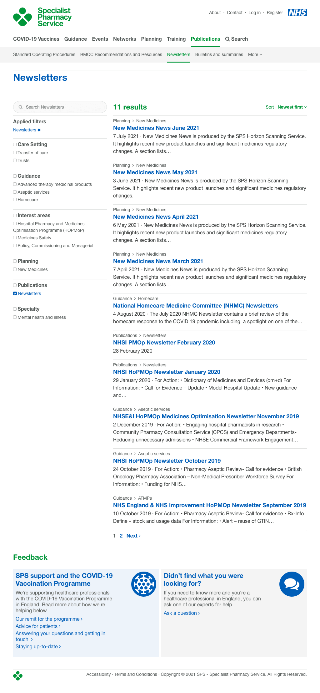
Based on user research and observation, we changed the way that users were able to search and ‘drill down’ to find the specific content or themes they were interested in. This was achieved with a mixture of topic-based filtering and integrating search within site content and themes. This optimised the path for users who would first find a broad topic area they were looking for, then being able to search more specifically and easily within.
We also addressed a long-standing problem of users not knowing or realising what content was on offer, e.g. with dentists or GPs frequently thinking SPS was for more of a pharmacy-specific setting and not for them. Now that content was starting to be written using our HTML authoring tools we knew we would be more able to create themed collections of content as well as related articles.
We were able to rework the main index pages using themed blocks of content with an editorial hierarchy which is automated by default but completely customisable by authors. This created a powerful system which renders pages where it is easy to find themes and specific articles, and discover a wider range of what SPS has to offer.
The final identity uses a symbol which felt like it had discovered rather than designed, with a timeless simplicity that looks like it has existed for decades. This symbol brings together the attributes of medicines, caregiver and expert.

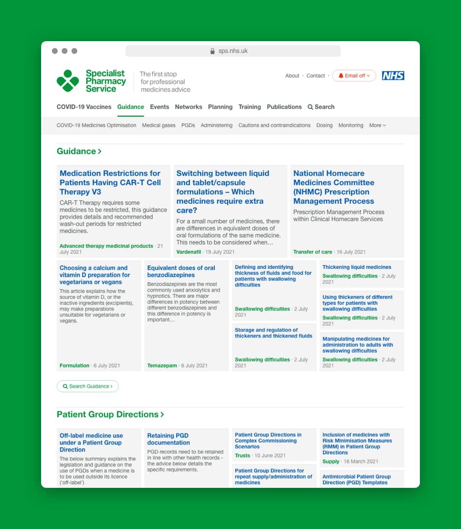
The web design focuses on content and text first, with sparing use of iconography and absolutely zero illustration or imagery. This has meant careful use of grid system, spacing, tones, type sizes and sparing use of colour to ensure that the content-heavy site has a clear hierarchy with deliberate areas of space to provide breathing room and prevent it becoming overwhelming.

The updated blocks-based system gave the site authors increased confidence and freedom. We are able to work with them during the pandemic to adjust and create better tooling around creating and navigating article series and collections. This allowed the team to create a central national repository of COVID-19 content with a full audit trail and change history. This played a crucial role in disseminating information on the handling of vaccines and enabling the set up of the national vaccination program.
The service is increasingly popular with more than half a million monthly active users in England.